ITD — Investigation Triage Dashboard
An in-house platform enabling Security Engineers to efficiently monitor, investigate, and escalate critical security events.

Project Overview
Scope
UX / UI
Timeline
2 Years - March 2020 to March 2022
Role
UX Designer
UX Researcher
Tools
Figma
Miro
Confluence
Pen & Paper
Methods
Competitive Analysis
Personas
UX Audit
User Interviews
Sketching
Wireframing
Prototyping
Team Members
Product Manager
Developers
Security Engineers
Description
For Security Engineers, time-to-ticket is critical—missing a signal during a shift can result in serious security risks, including data breaches.
The Investigation Triage Dashboard (ITD) is a platform used by Arctic Wolf’s S2 (Security Services) Concierge Security Team to monitor, investigate, and escalate security events across their entire customer base. From unusual login activity and unexpected network changes to firewall modifications and ransomware threats, ITD ensures that the right information surfaces at the right moment.
Problem
As Arctic Wolf’s customer base grew, so did the volume of incoming security data. Triage Security Analysts (TSAs) and Triage Security Engineers (TSEs) needed to investigate and escalate events faster within time-sensitive shift work.
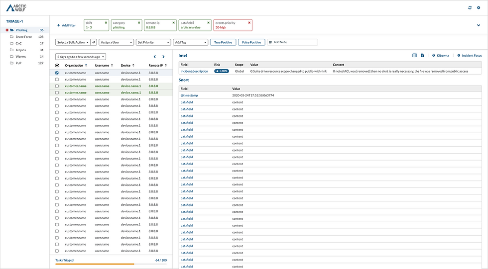
The existing Kibana dashboard was not designed for this workflow:
Excessive scrolling to locate relevant data
Manual creation of filters
Critical information buried within complex datasets
This resulted in increased cognitive load, slower response times, and reduced efficiency—directly impacting security outcomes.
Solution
Replace the costly third-party Kibana dashboard with a custom-built, in-house Investigation Triage Dashboard designed specifically around Security Engineer workflows.
The goal was not only cost reduction, but to:
Eliminate friction in daily triage workflows
Reduce time-to-ticket
Create an intuitive, scalable system
Support evolving data complexity and workflows
Exploration & Discover
Competitive Analysis
Why?
To understand how competing platforms handle triage workflows, especially since many Security Engineers had prior experience with them.
Findings:
Common workflow patterns across platforms
Opportunities to streamline filtering and investigation flows
Insights into what worked—and what didn’t—in real-world usage
Impact:
Helped define key user personas and workflow expectations.
Personas
Why?
To clearly define who the platform serves and their specific needs.
Findings:
Differences in shift patterns and responsibilities
Variation in data interpretation and escalation workflows
Key pain points across experience levels
Impact:
Guided targeted research and informed user interviews.
User Interviews
Why?
To understand real workflows, frustrations, and expectations.
Findings:
Filtering workflows were time-consuming and inefficient
Core tasks required unnecessary steps
Engineers had strong mental models for how tools should behave
Impact:
Led to a full UX audit of the existing system.

UX Audit
Why?
To evaluate usability issues within the Kibana dashboard firsthand.
Findings:
Steep learning curve for new hires
Experienced users relied on workarounds (“hacks”)
Poor information hierarchy and discoverability
Impact:
Provided a foundation for redesigning workflows and interface structure.
Sketches
Why?
Rapid exploration of layout and workflow ideas.
Findings:
An “Inbox” style interface emerged as a strong solution:
Familiar mental model (inspired by tools like email and messaging platforms)
Supports continuous inflow of new data (“evidence”)
Enables quick scanning and prioritization
Impact:
Defined the core interaction model for the platform.
UX Design Process
Working 1–2 sprints ahead of development enabled:
Continuous design delivery
Iterative testing with engineers
Feedback-driven refinement before implementation
Flows
Mapped end-to-end user flows based on real workflows to understand system complexity and ensure coverage of all critical tasks.


Wireframes
Low-fidelity layouts explored structure and hierarchy:
Rapid iteration
Established UX patterns
Defined layout for high-density data environments

Prototypes
Interactive Figma prototypes allowed engineers to:
Perform real tasks
Simulate workflows
Provide actionable feedback
Testing
User testing revealed:
Strong alignment with mental models
Improved efficiency in key workflows
Areas needing refinement in interaction patterns
Iteration
A continuous cycle of:
Design → Test → Feedback → Refine
Close collaboration with engineers ensured the platform evolved alongside real user needs.
Validation
Worked closely with developers to ensure:
Feasibility of design decisions
System performance under high data loads
Alignment between frontend experience and backend architecture
Final Design
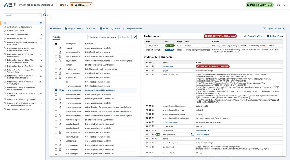
Why This Solution?
The “Inbox” style interface was chosen for its:
Familiarity and ease of adoption
Efficient handling of incoming data streams
Scalability for future workflows
Key features:
Evidence list + detail panel (file-folder metaphor)
Case-building functionality for escalations
Support for multiple levels of security investigation
This design improved usability while maintaining flexibility for evolving security needs.
Other Solutions Considered
Multiple layout explorations were tested during sketching and wireframing, but the inbox model consistently performed best in usability testing and aligned most closely with user expectations.
Impact
Optimized For Efficiency
Reduced time-to-ticket
Fewer steps to access critical data
Security relevant fields
Improved efficiency in triage workflows
Lower operational costs by replacing third-party tooling
Learnings
Key Takeaways
Early prototyping is critical—static designs aren’t enough for complex tools
Fast iteration leads to faster insights
Small interaction details (like button placement) significantly impact efficiency
What I Would Do Differently
Maintain a detailed UX: Project Log for decisions and learnings
Integrate the design system earlier in the process